Sage green is one of the most famous colors with its own identity and importance. Learn more about this beautiful shade of green found in homes, offices, gardens, and fashion.
What is Sage Green color?
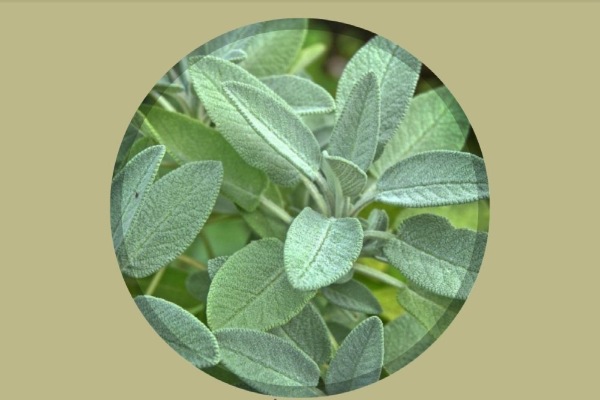
Sage is a shade of green that is soothing but has a muted and subdued tone. The color gets its name from the dried leaves of the sage plant native to the Mediterranean region. It is a pale, soft green color that mostly has a subtle gray or blue undertone, giving it a cool and earthy feel. This color often reflects nature, balance, and harmony making it a popular choice among fashion designers, interior designers, and wedding planners.
How to make Sage Green color?
To create sage green, all you gotta do is mix green and gray paint in varying amounts until you achieve the desired hue.
HEX color code for sage green is #BCB88A.
RGB values are R: 188, G: 184, B: 138.
CMYK code is 0, 2, 26, 26.
Talking about the web design, the Web Safe code for sage green is CCCC99.
So, whether you’re painting your house or creating a website design, sage green can add a calming and earthy touch to your project for sure.
Also, Read Color Drenching 101: Techniques, Tips, and Transformations
What colors go with Sage Green?
Sage is an extremely versatile color that can pair well with different variety of other colors depending on the desired look and feel. Some popular color combinations with sage green are:
Sage and White: Sage green can be paired with white to create a fresh and light atmosphere, giving it a classic and clean look.

Sage and Navy: These two colors make a popular choice for a nautical or coastal theme. Navy blue adds depth contrast to sage green.
Sage and Gray: Sage green and gray give a soft and soothing color combination and create a relaxing and peaceful atmosphere.
Sage and Gold: Sage green and gold is a luxurious and elegant color combination. Gold helps elevate sage green to create a sophisticated and chic look.
What colors match sage green?

This green is a versatile and neutral color that goes well with many other colors like cream, beige, white, gray, navy blue, burgundy, and soft pink.
What colors resemble sage green?
Colors that look similar to sage green are olive green, moss green, and seafoam green. Other shades of green like chartreuse and pistachio, can also be similar to sage green.

Also, muted shades of blue and purple, such as lavender and periwinkle look like sage green.
What is the history of Sage Green?
Sage green is not a new color in fashion. It has been used in interior design and fashion for centuries, dating back to ancient civilizations such as Egypt and Greece. During that time, this color was used to represent nature and growth.
In the Renaissance period, this color was used in art and textiles to represent the natural world and the beauty of the outdoors. In modern times, the color has seen a resurgence in popularity due to its calming effect and versatility. It has become a popular choice for home decor, fashion, and branding.
What does sage green symbolize?
Sage green often shows nature, tranquility, and balance, representing growth and harmony. It is also believed to evoke a sense of calmness, relaxation, and renewal. It can symbolize freshness, sophistication, and a connection to the natural world.
Role in interior designing
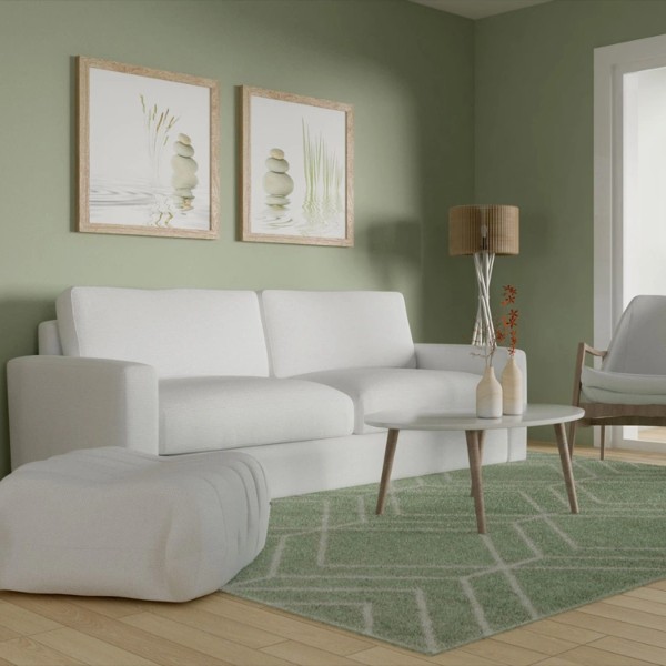
Since this beautiful color is versatile and extremely soothing, it has become very popular in interior design in recent times. It is a muted green hue that suits many other colors, making it a perfect choice for numerous design schemes. This pretty color helps create a calm and relaxing atmosphere when used in large amounts or adds a subtle touch of color as an accent.
When designing a bedroom or a living room with sage green, it is essential to balance this color with other neutral colors like white, beige, or gray. This combination helps to create a calm and balanced look that doesn’t overwhelm the space. Sage green also goes well with warm neutral textures like wood, jute, or woven fabrics, adding a natural touch to a space.

If you’re thinking of creating a contemporary look with sage green, you can pair it with cool colors like navy blue or deep teal. This combination creates an elegant and timeless look. To create a more traditional design, combine sage green with muted yellow colors or soft pinks to create a romantic atmosphere.
This color can also be used on walls, furniture, or accents such as throw pillows, curtains, or even rugs and carpets. When used in a larger amount, sage green gives a room a feeling of being more spacious and calming. Meanwhile, smaller accents add a pop of color without overwhelming the space.
Sage green is a great color for interior designing and its versatility and calmness are what make it a popular choice for various design styles at homes, offices, or restaurants.
How does this color make photography beautiful?
Whether you’re photographing nature, portraits, or still life, sage green can make it look more natural and harmonic.
One best ways to add sage green to your photography is by using it as a background or a prop. For this, you can use sage green fabrics, backdrops, or even paint a wall in your studio to create a unique and calming atmosphere.
This color can also make a great complementary color for other natural tones like earthy browns or muted blues.
Color grading is another great way to add sage green to photography. It involves adjusting the colors of a photo to achieve a particular look or mood. You can add a touch of sage green to your photographs by adjusting the hue and saturation of certain colors like the greens and yellows in a landscape photo.

For those who love black-and-white photography, sage green works in your favor too. Using sage green props or backgrounds in a black-and-white photo can add a subtle tone to the photo, creating a timeless and classic look.
Overall, sage green is a versatile and underrated color that can add a natural and soothing touch to your photography. By adding this color to your photos, you can create a unique and harmonious atmosphere that will capture the true beauty of the subject.
In branding
Sage can give feelings of wellness, harmony, and tranquility, making it a famous choice for brands in the wellness and health industry.
This muted green hue also expresses a sense of nature, growth, and sustainability, making it popular among eco-friendly brands or organic spaces. This color’s softness can bring peace, mind stability, and reliability, making it a great choice for financial or legal brands.

When adding sage green into branding, it is important to think of color psychology and how it affects consumers’ perceptions. Combining this green with other muted or earthy tones like browns, grays, and creams, can create a natural and calming palette that can give amazing results.
To give a more playful or energetic feel, you can pair sage with brighter or more saturated colors, such as coral, pink, or yellow.
In videos and films
Sage is a versatile color that can evoke different emotions in films and videos.
In nature-related documentaries, sage green can represent growth, balance, and harmony in the environment. For romantic scenes, it can also be used to create a peaceful atmosphere. In dramas and crime shows, this shade of green is used to represent wealth and sophistication.
It can create a more natural and organic feel in the videos when paired with other earthy tones.
Also, Read Perlite vs Vermiculite: All You Need To Know
